Many of us make yearly resolutions, only to drop off within the first quarter. People go to the gym to get in shape, look better – but results take time to show, and the steep learning curve definitely doesn’t help either.
How can we motivate and finally fulfil the resolutions of these people? This rebranding aims to position EQUIP to target this demographic.
a new personality
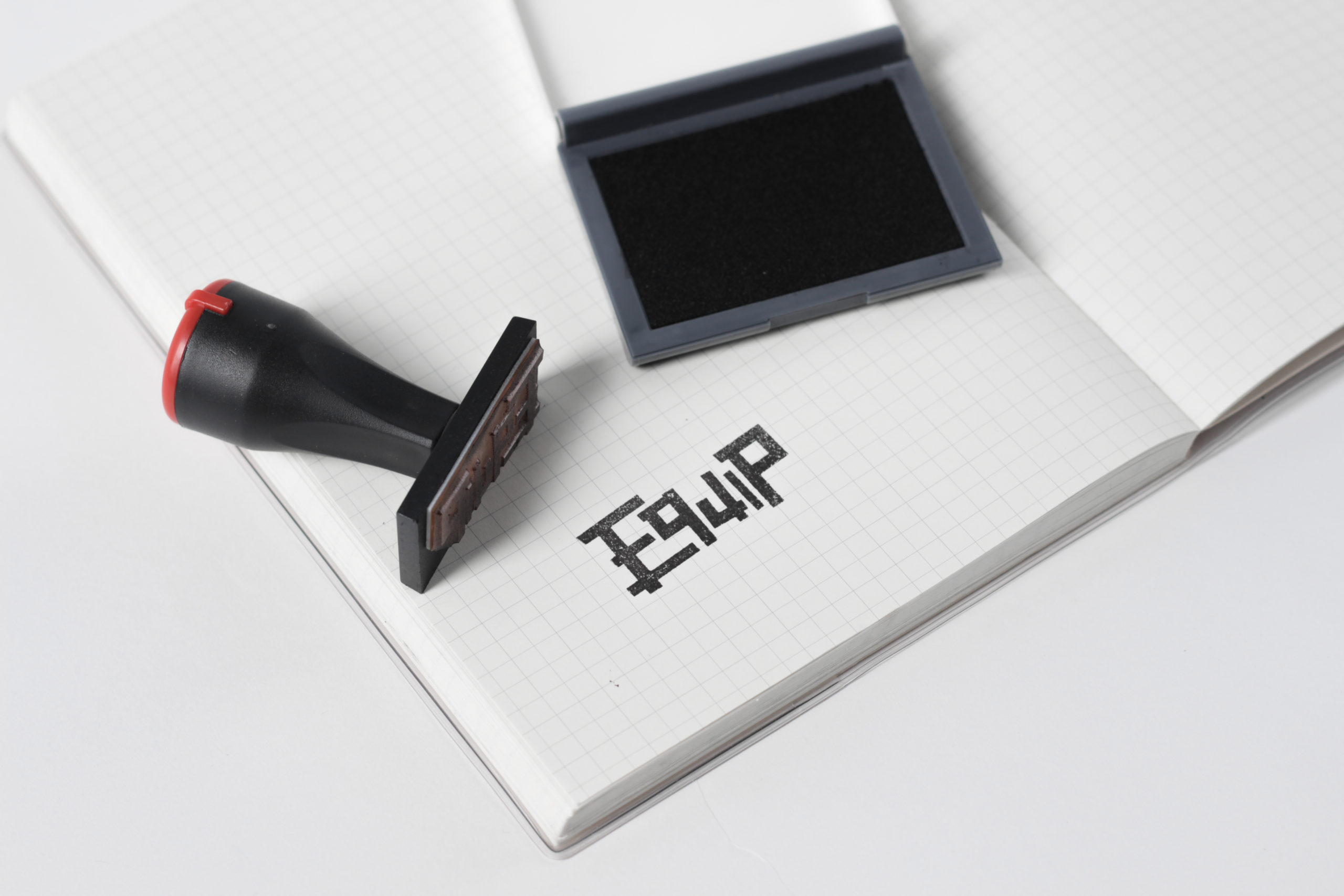
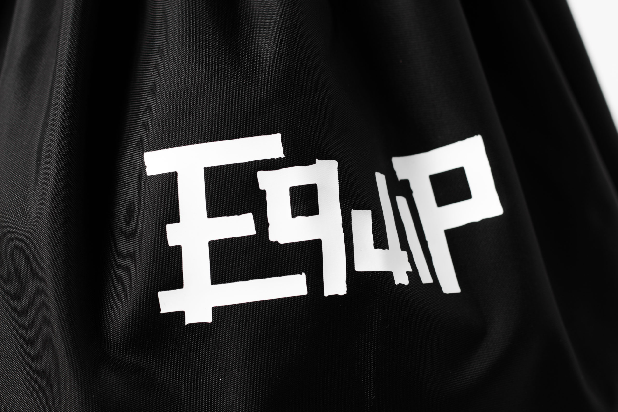
We wanted the logo to speak to our clients just like how EQUIP’s employees motivate their clients to achieve their goals. It had to feel personal.
This is why we’ve opted to use the imperfection of torn tape to form EQUIP’s logo. The resulting textures and corners give a rough look that carries an attitude; a personality that is energetic, spontaneous and passionate.
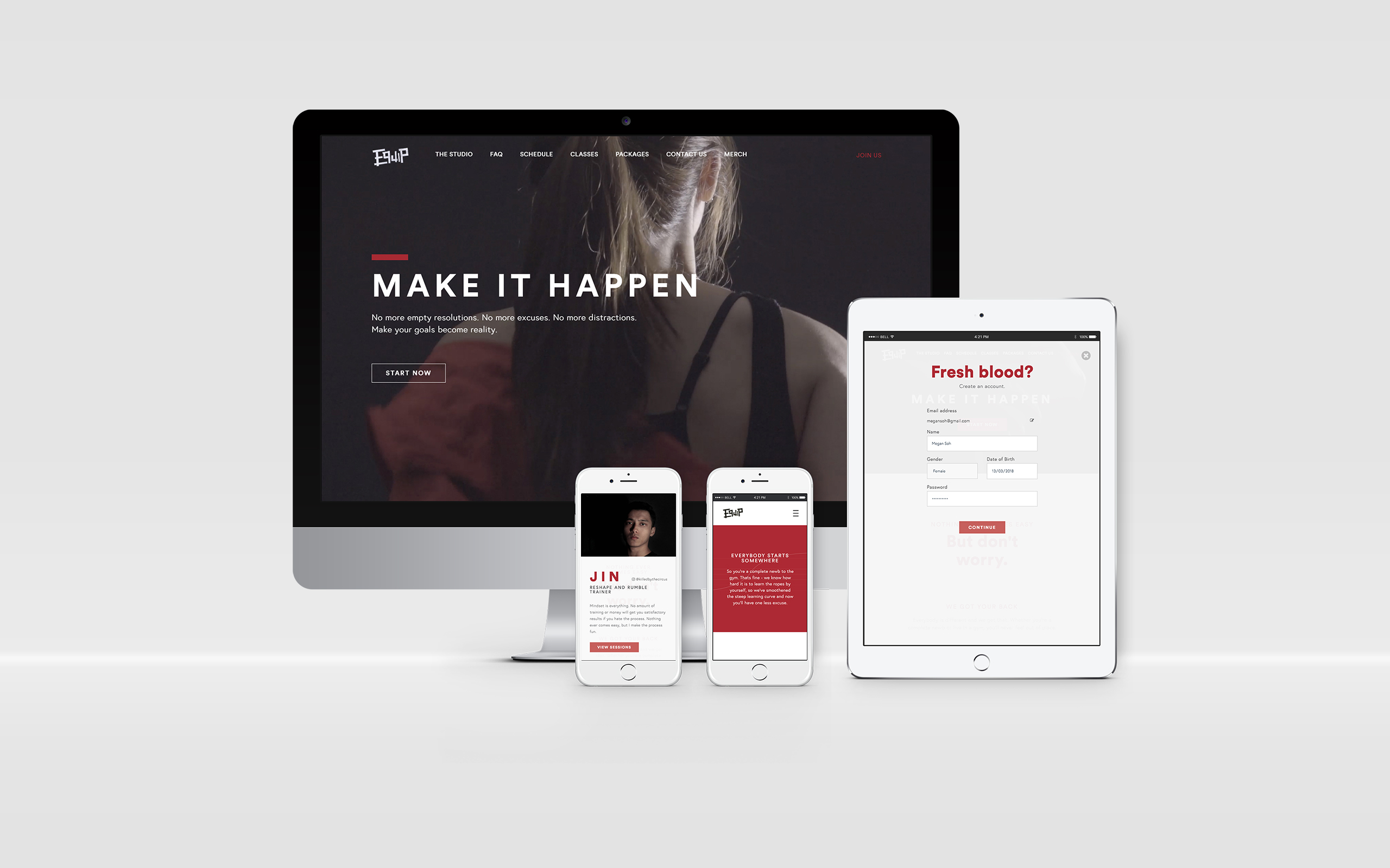
a refreshed web experience
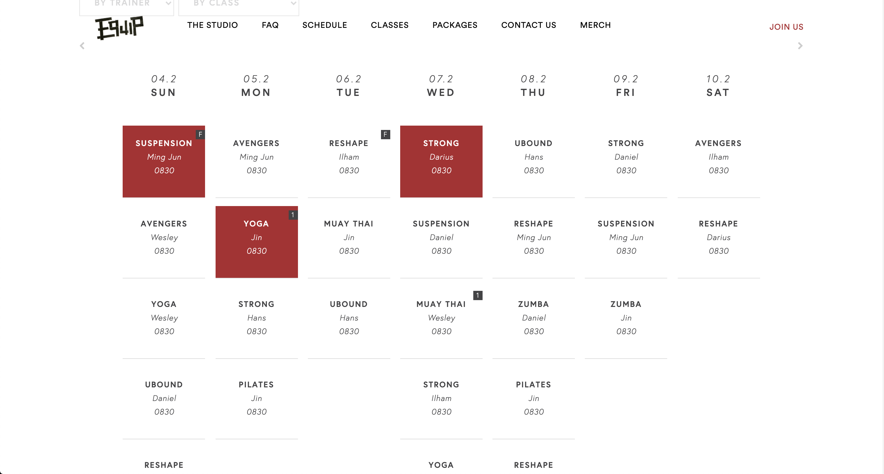
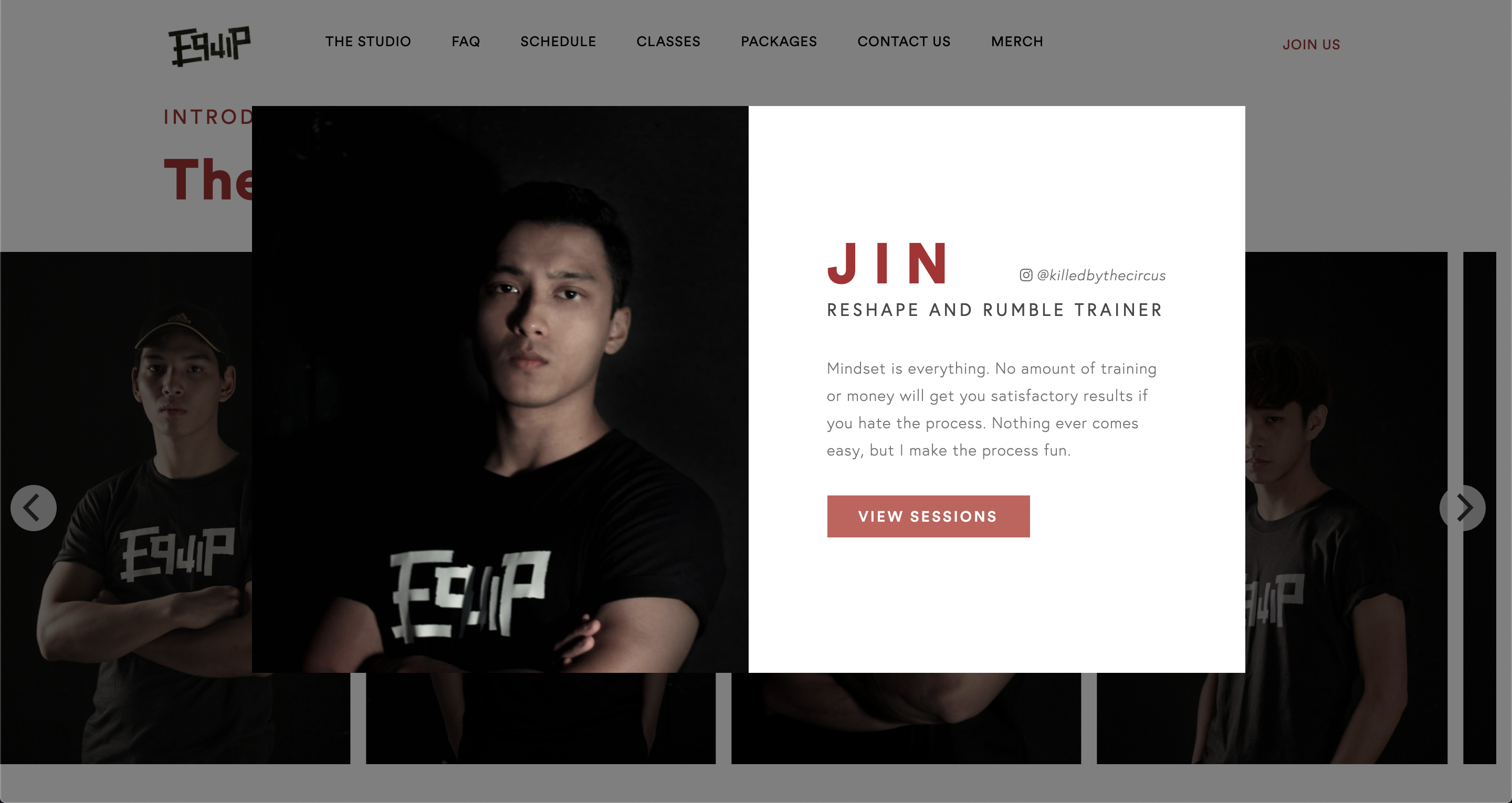
The website is one of the most important touchpoints for EQUIP as it’s usually the first point of contact with the brand. Our goal for this redesign was to create a seamless signup process. View it here.
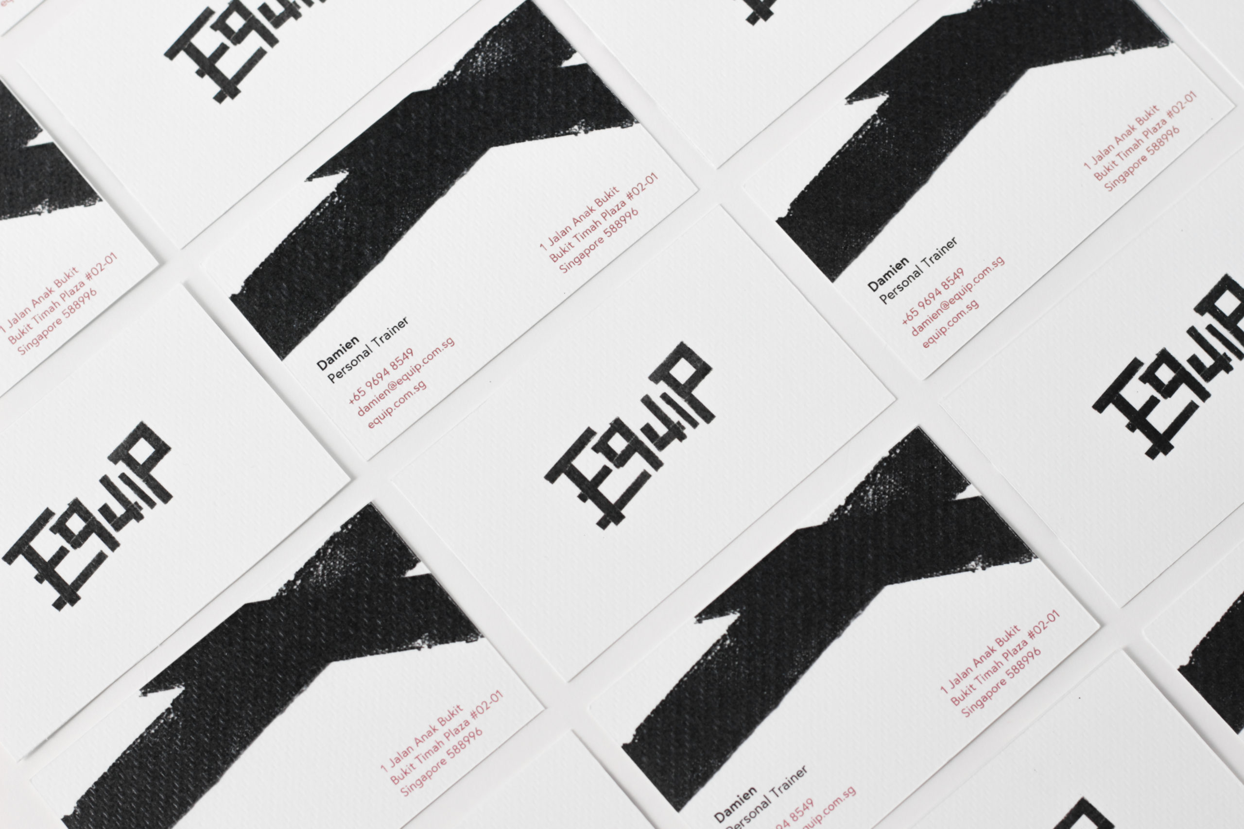
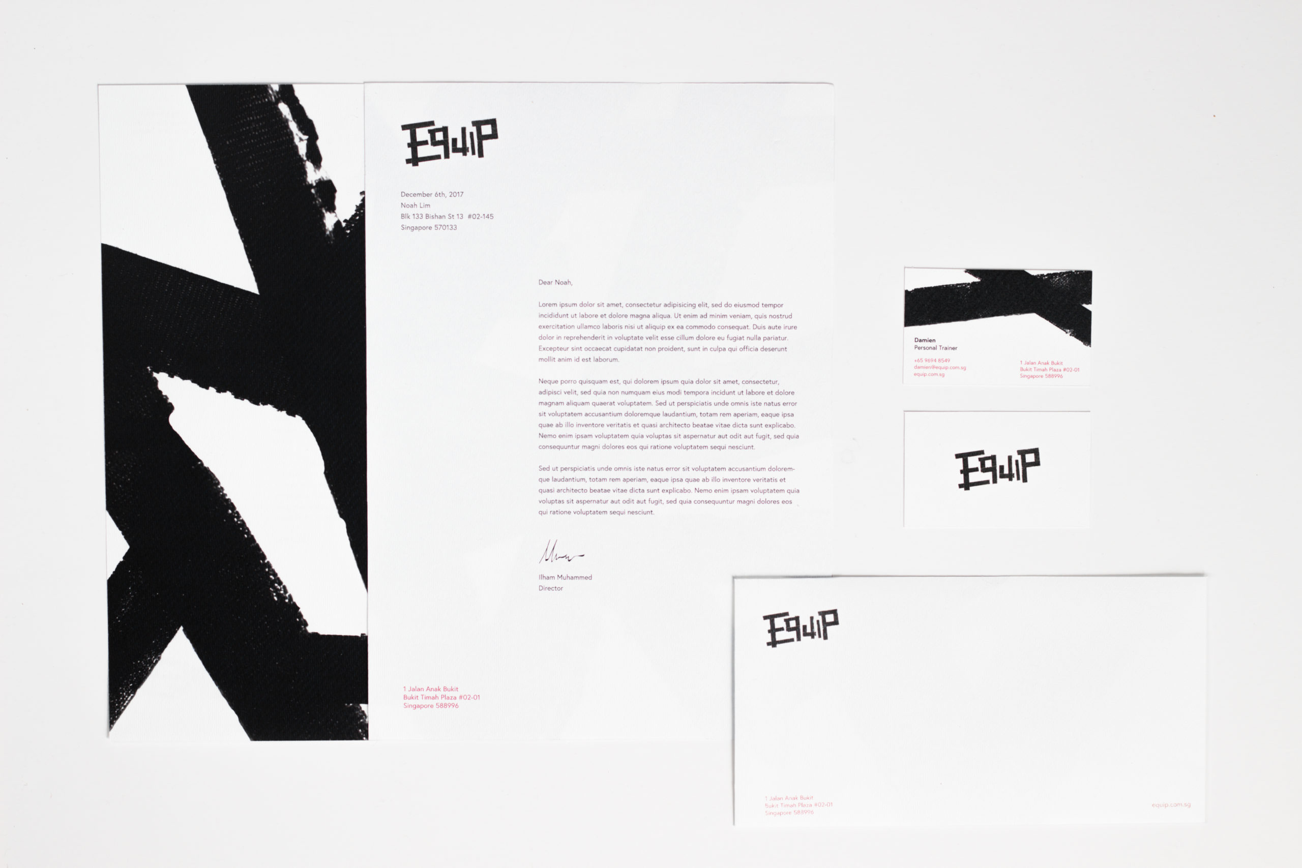
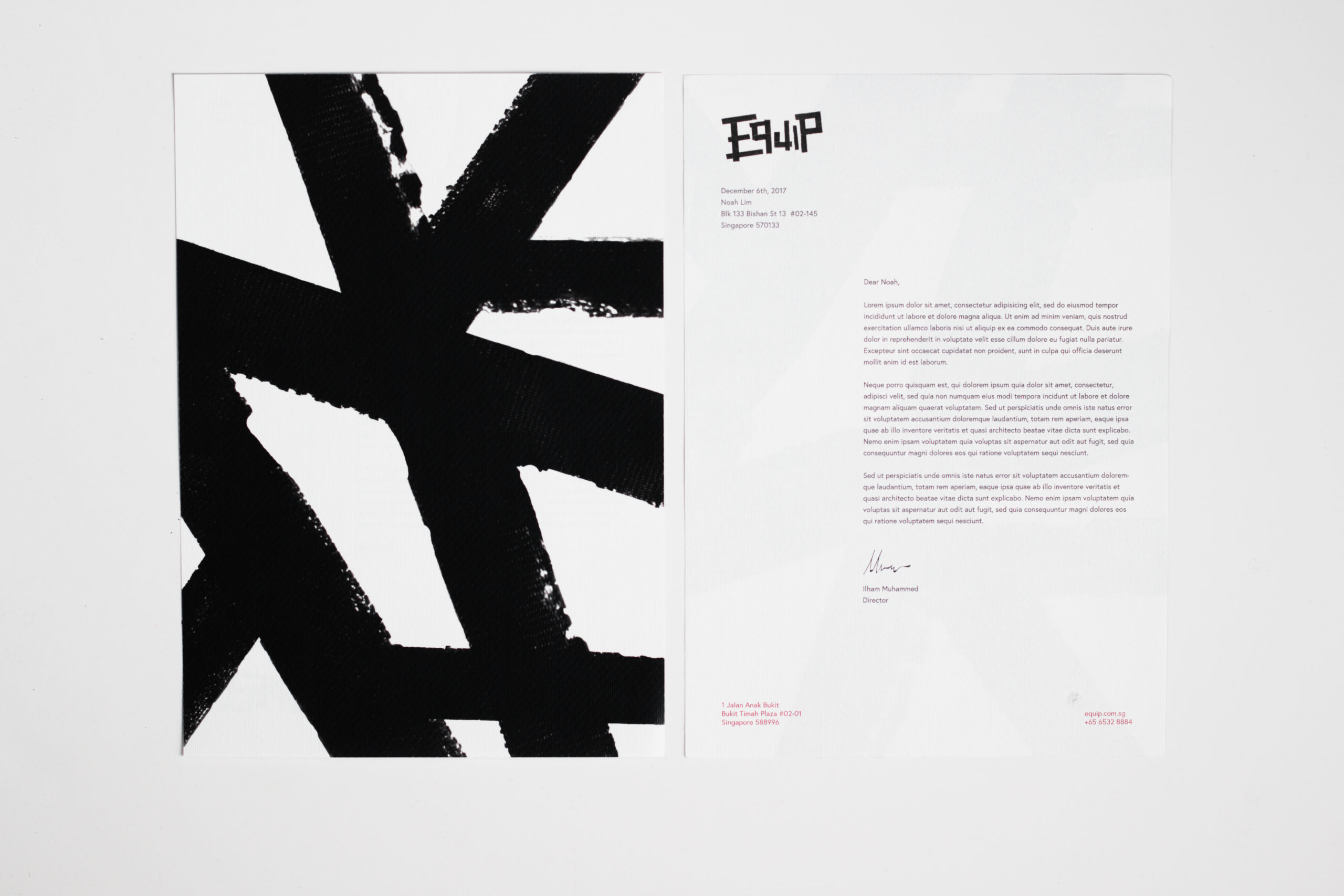
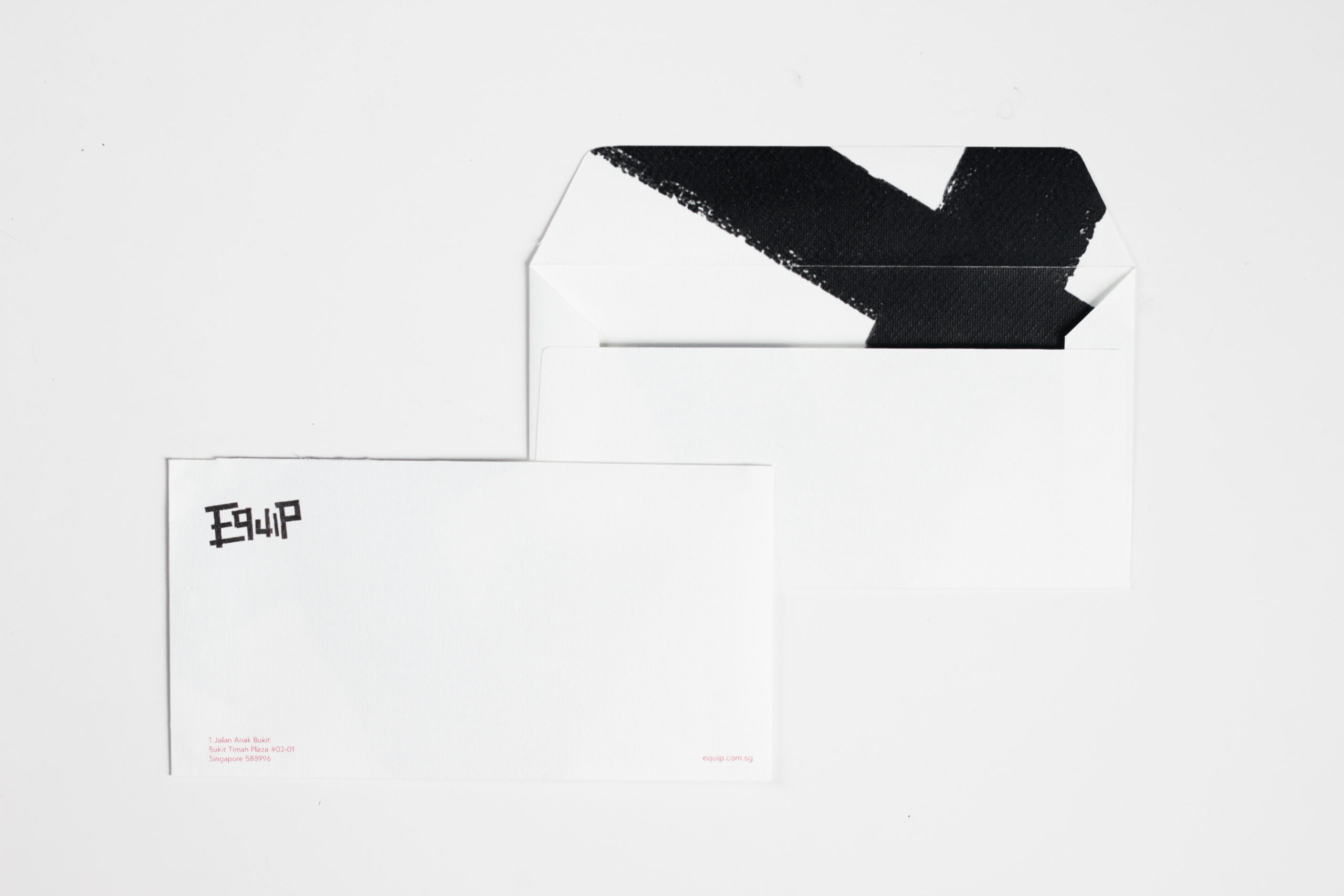
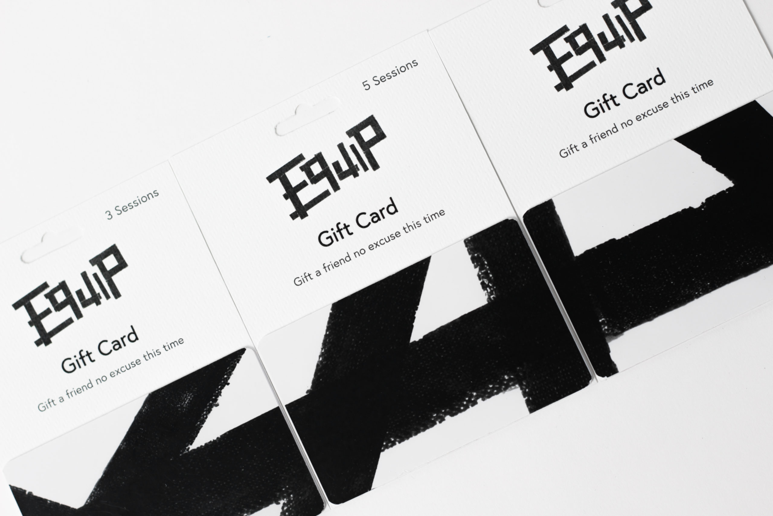
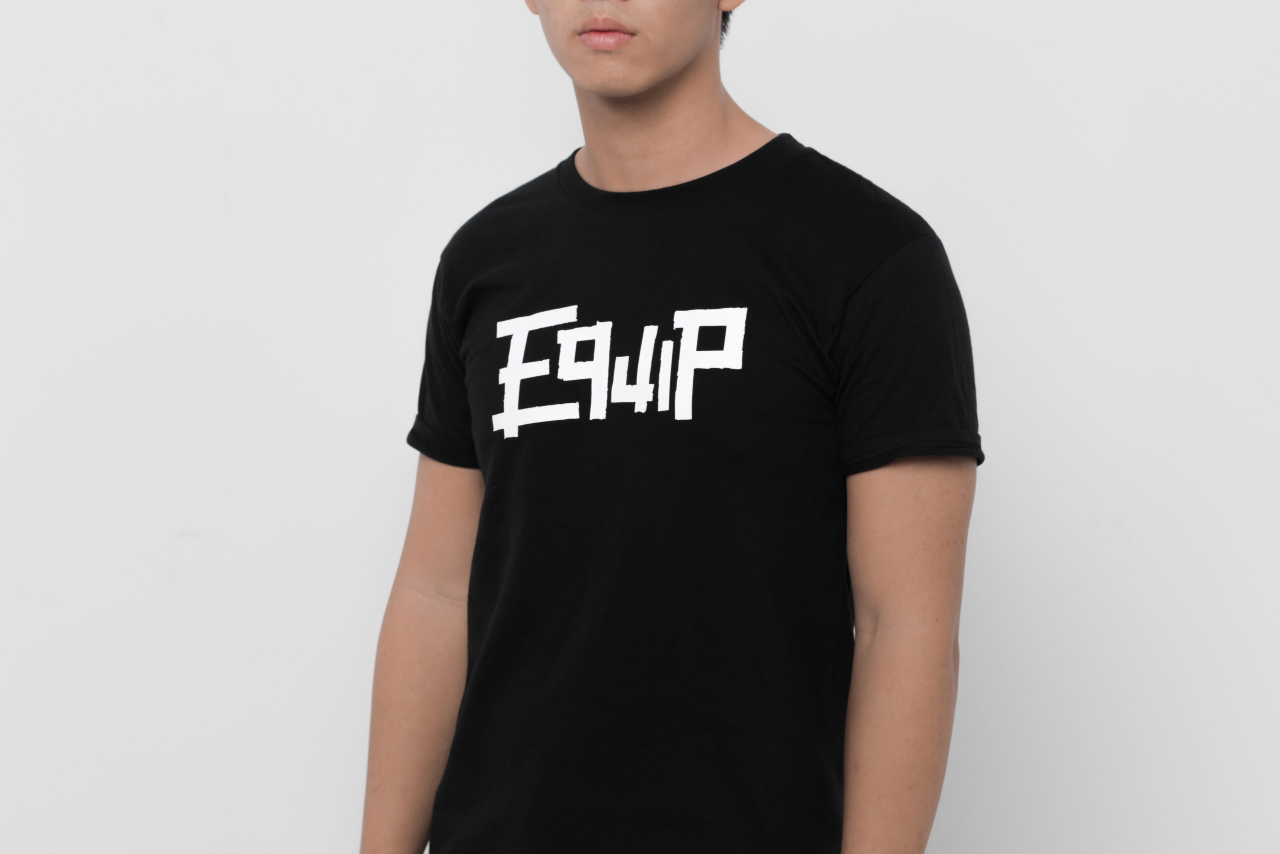
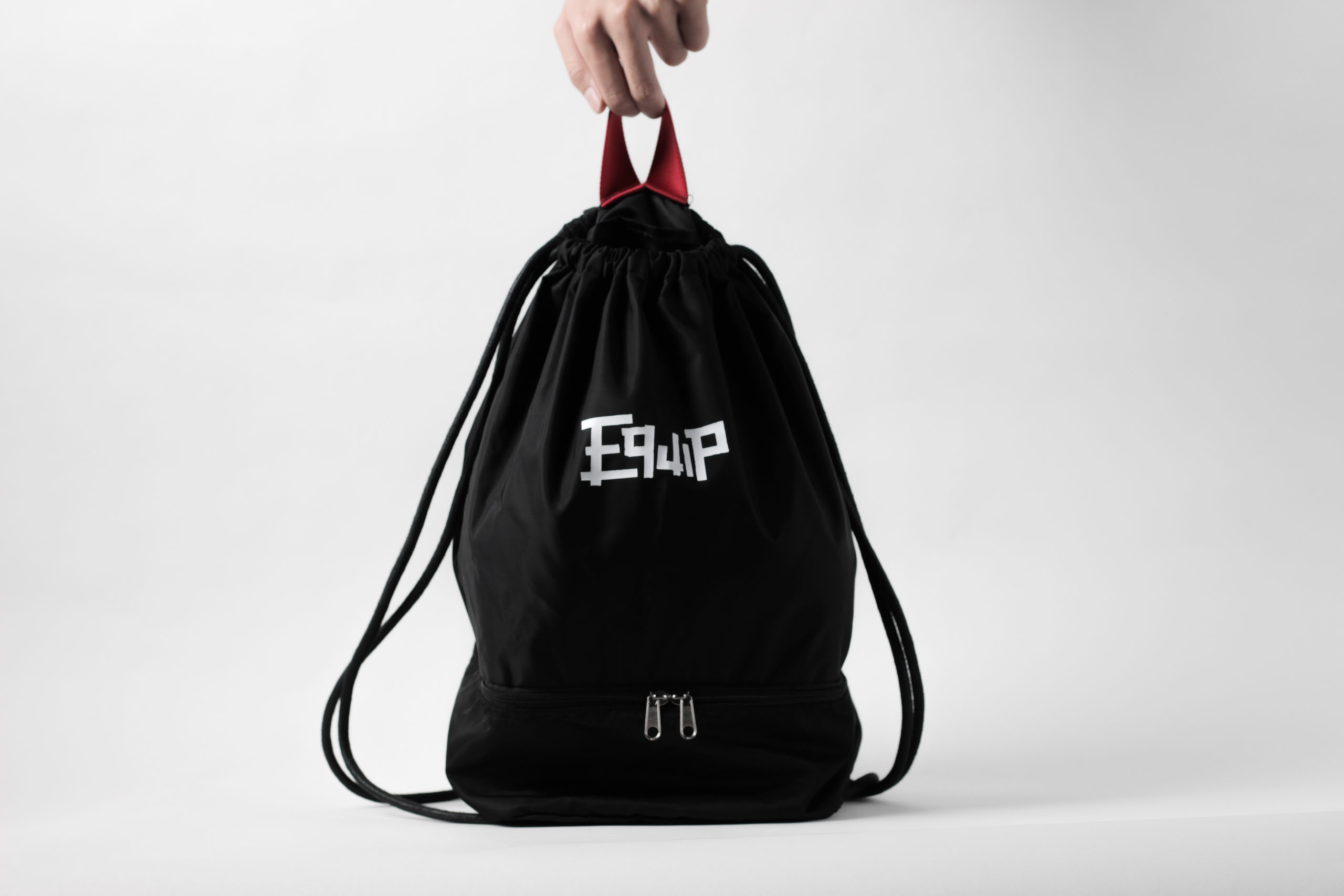
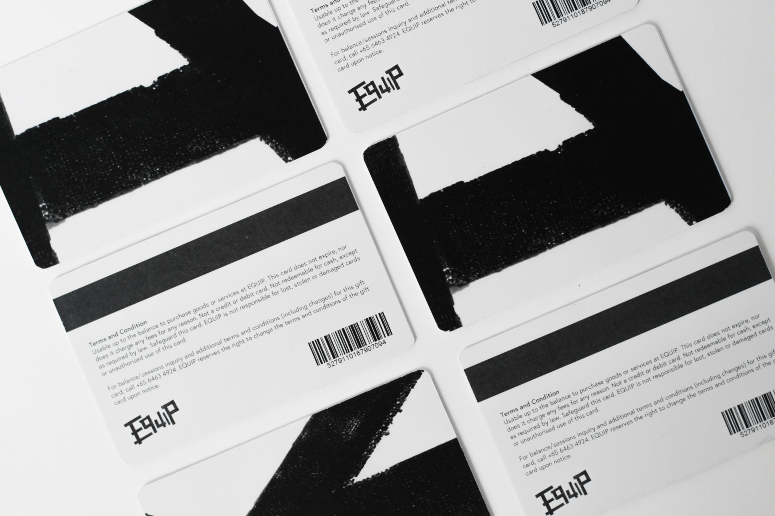
brand collateral
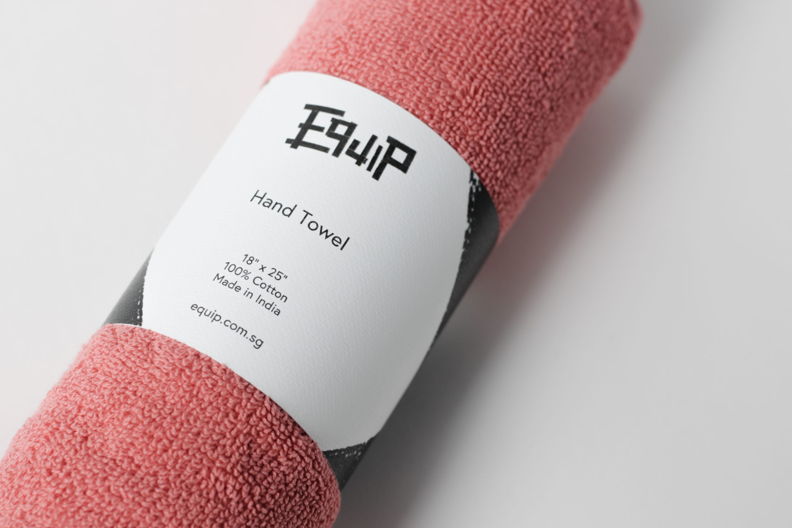
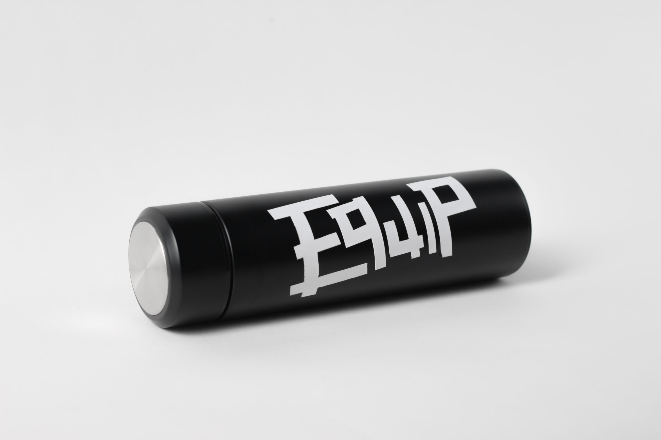
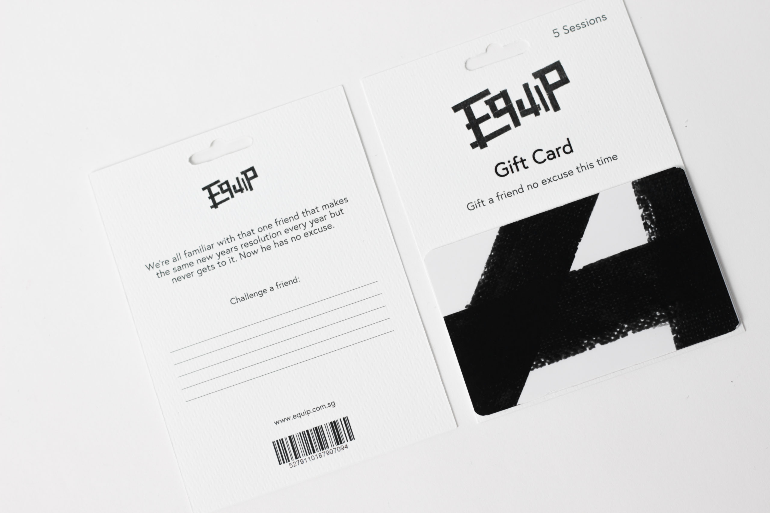
We’ve used the tape element from the logo as an identifying graphic across the brand collaterals, for consistency and an instantly recognisable image.
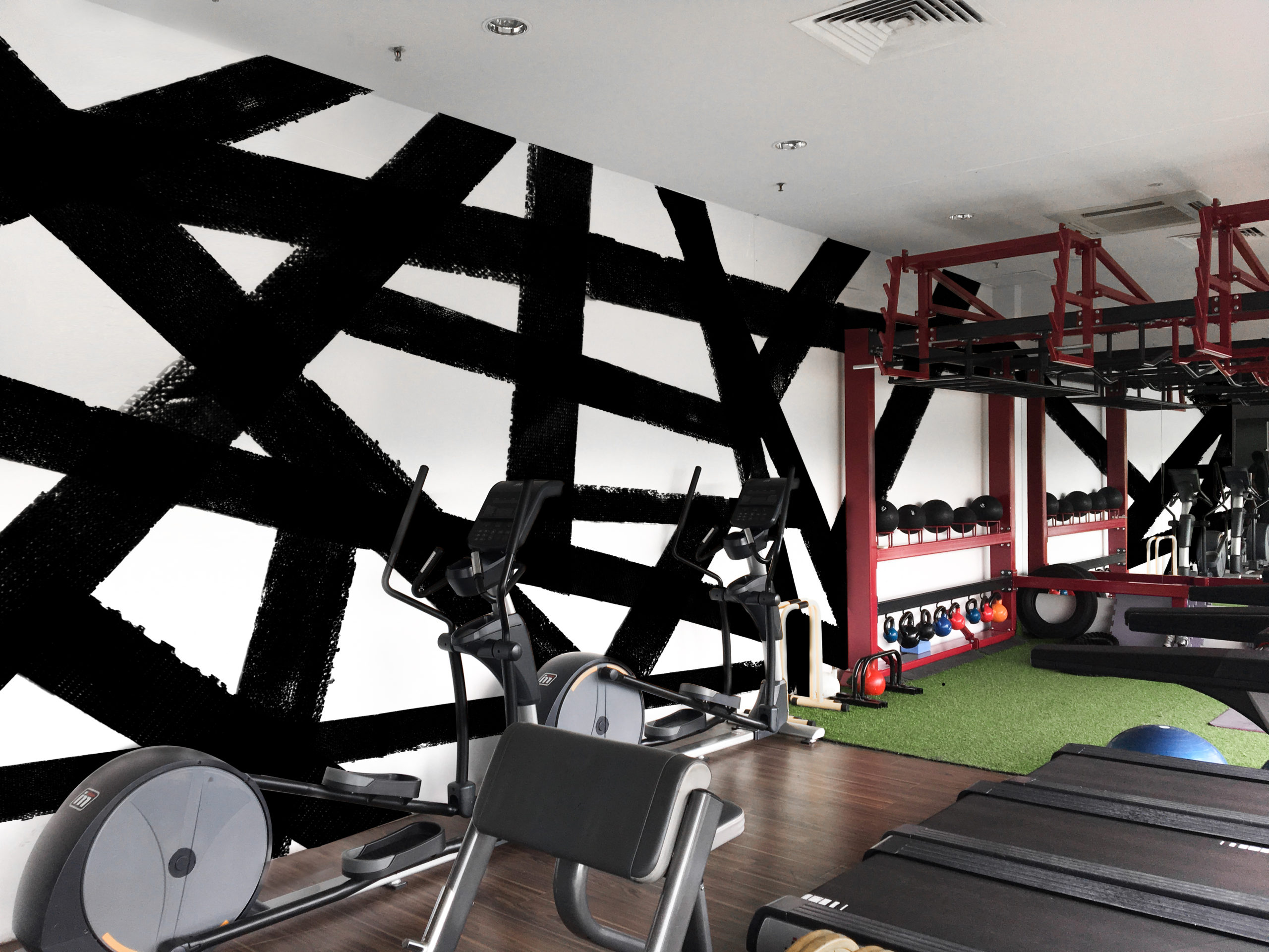
on-site experience
A wall mural was created with the brand’s tape element, serving to identify EQUIP at a glance in any media content.