UX case study
FastQ Concept App
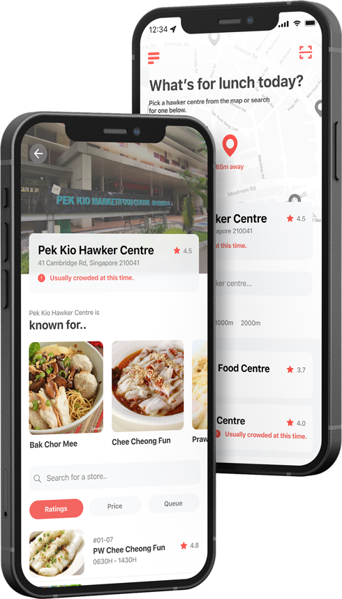
Hawker centre culture is uniquely Singaporean. It is a source of pride for many Singaporeans, and remains one of the staple choices when we think of food. What’s not to love about great food at cheap prices?
However, it’s fair to say hawker centres have yet to fully catch up with technology, and some experiences could be made better increased adoption. This project is an attempt to do just that – improve the hawker centre experience with technology.
background
Acceleration by circumstance
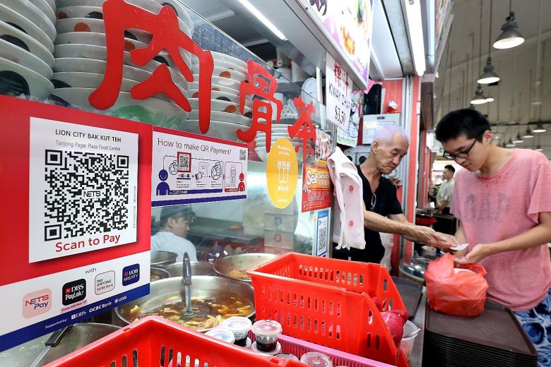
Hawker centres, in their current state, have begun to adopt some technology – one such example that was accelerated by the COVID-19 pandemic is the adoption of cashless payment.
Other technological solutions for common pain points are food delivery apps such as Grab & FoodPanda, which have recently started to carry hawker foods.
Current solutions just aren't enough
However, several user experience gaps remain despite such introductions. For one, there is a notable lack of information available on store details in hawker centres. Store menus and opening hours often cannot be found online.
..especially for our working adults.
Food in the CBD tends to be more pricey – naturally leading to hawker centres being a more economical, and hence, popular choice among our working adults. Of course, this also means that the more popular stores will see long queues during the rush hours.
With so much already on the plates of our busy working adults, having to jostle with large crowds and queue in long lines is just about the last thing to look forward to in the middle of a gruelling work day.
We’ve hence decided to tailor our research to these working adults, as we feel that their pain points have not been sufficiently relieved by current solutions.
kickoff
Understanding our users

Gaps in the hawker experience
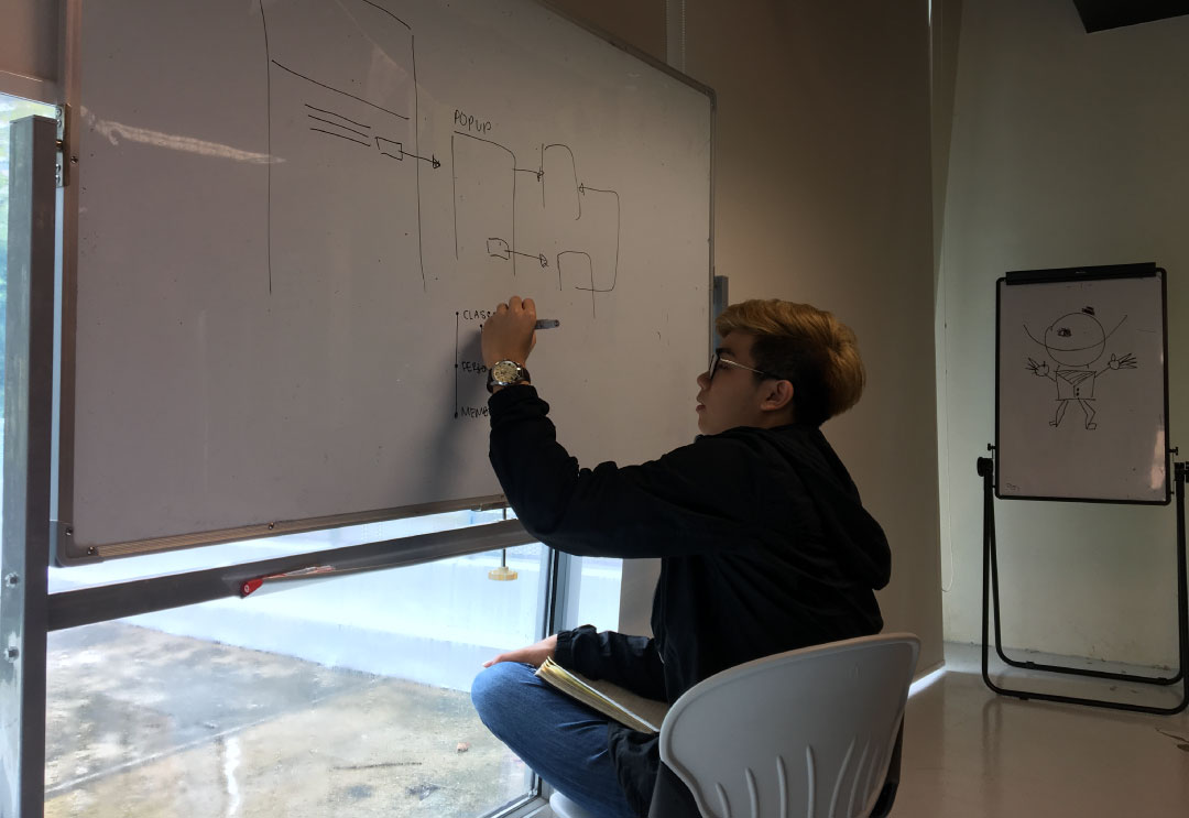
We conducted interviews with 8 working adults. Our goals were to find out about working adults’ eating habits for lunch, and the challenges that they faced at lunch every day.
Half of these interviews were contextual interviews, allowing us to better observe our participants’ habits that may not have been uncovered during the interviews, or possibly subconscious decisions that the participants may not bring up during an interview.
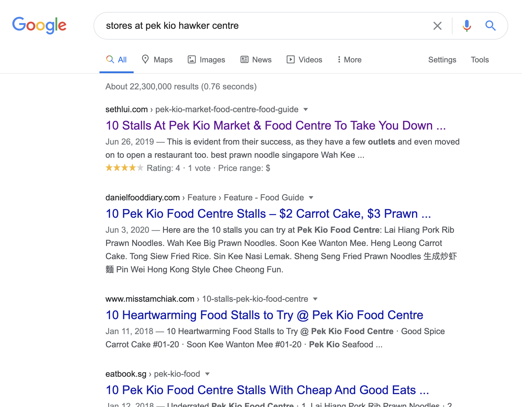
Store menus & directories aren't available online.
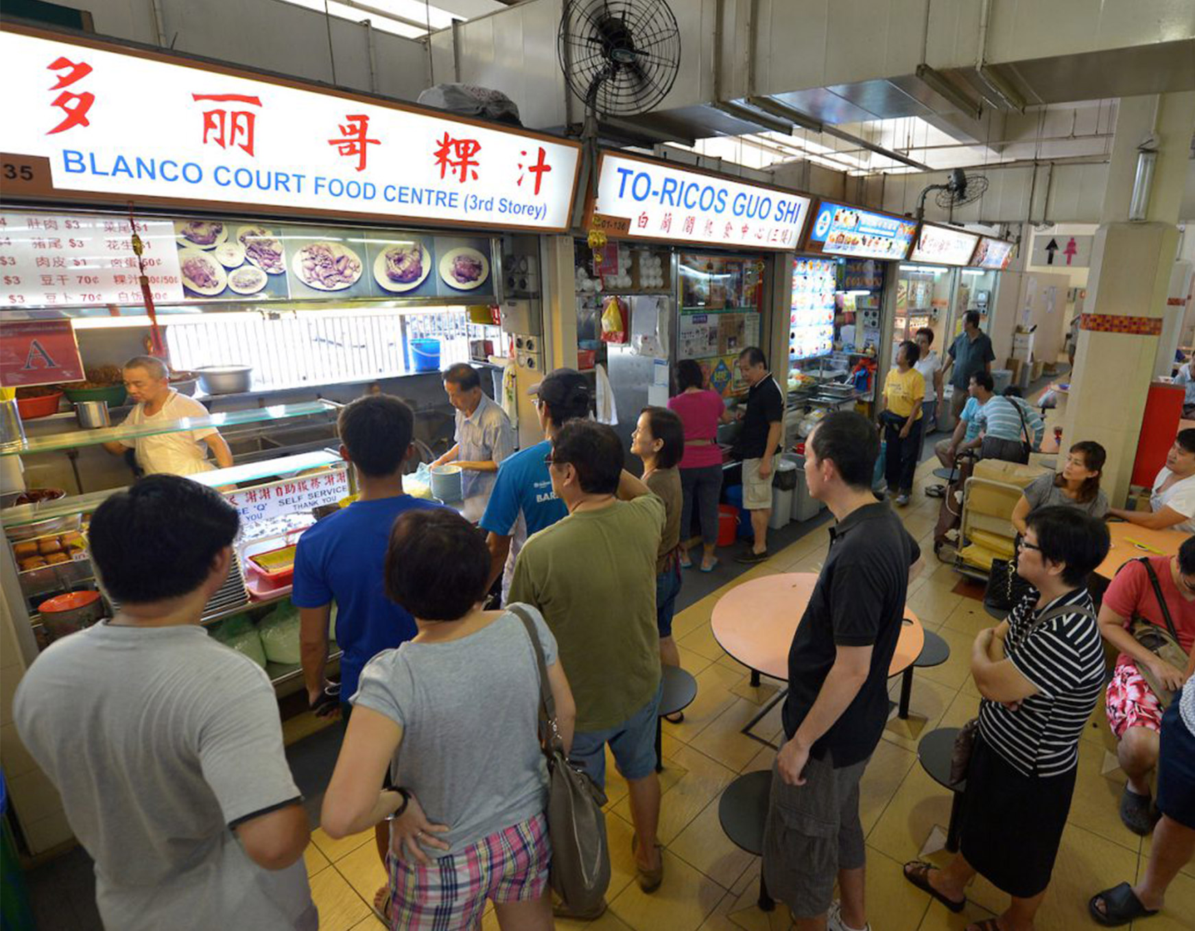
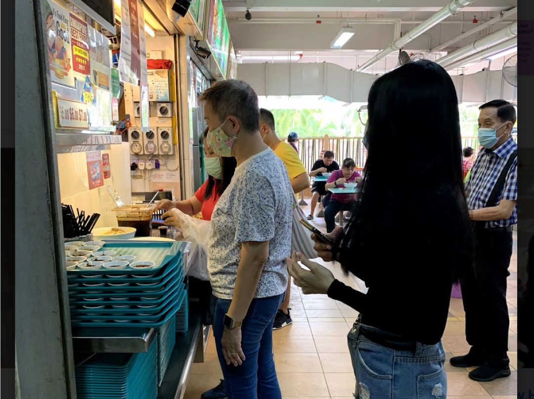
Long queues at popular stores.
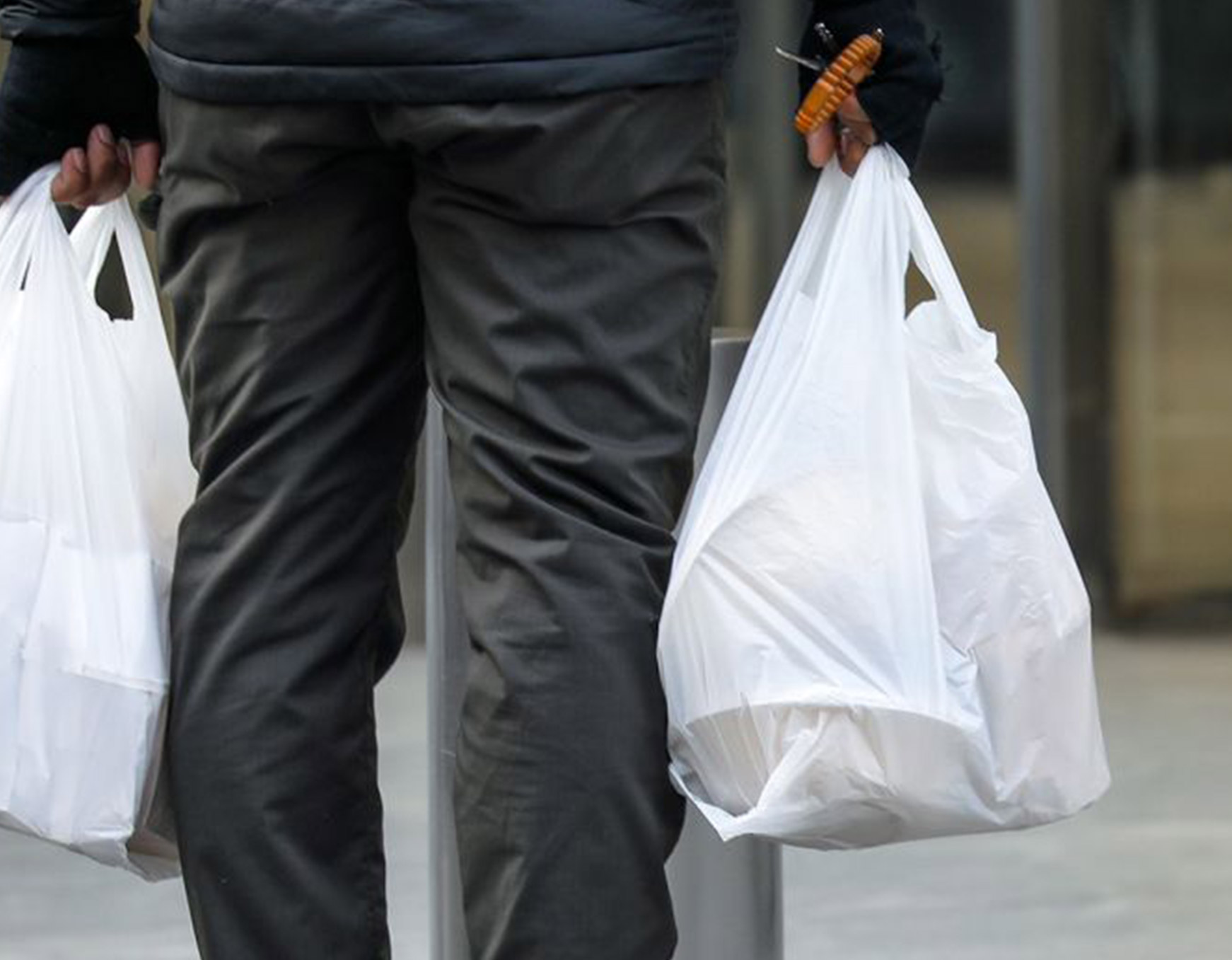
Food taken to-go is less satisfactory.
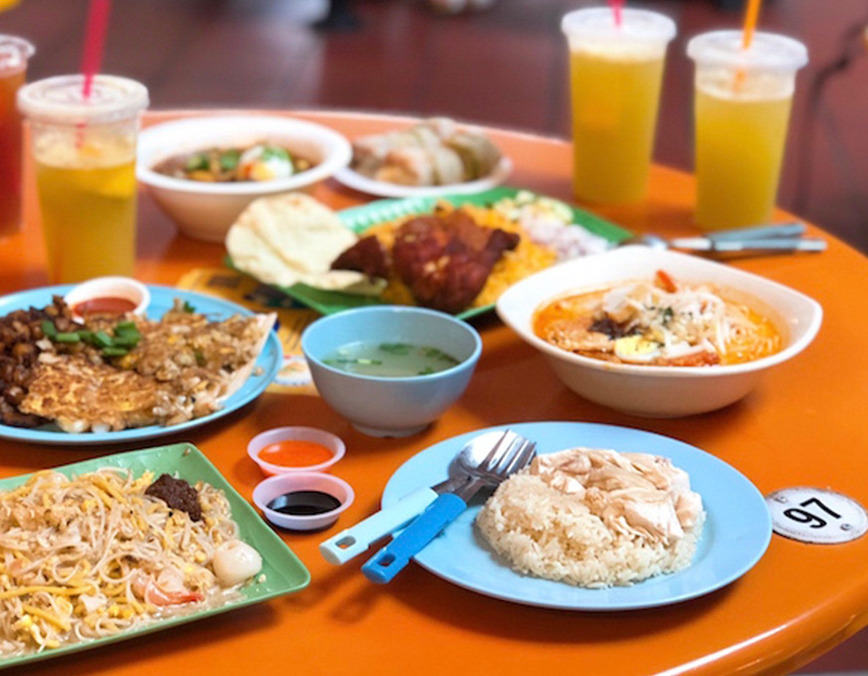
Difficult to order from multiple stores.
further insight
Gaps in the delivery solution?
A few participants turned to delivery services as a solution to the challenges they faced during the lunch hour. At this point, we realised that we could shift our focus to the challenges that arose with delivery services.
Being economical is the entire point.
The main appeal of hawker centres is cheap food. This is entirely taken away with the usage of a delivery service – with delivery fees of at least $1.50, and rising platform fees, a simple plate of chicken rice can cost you $6 or more.
Not to mention the small order fees, which is an additional fee charged if your order fails to reach a minimum amount.
reframing the problem
Delivery services are not a viable long term solution.
People turn to delivery services out of convenience. They simply want to enjoy a good meal without the associated frustrations of eating in – but these services are simply not viable in the long term financially. The nature of a limited rider supply mean that costs will continue to rise, leaving a market of users who won’t consider delivery options as a daily solution to their frustrations.
How might we ensure a frictionless hawker experience for our working adults?
This left us with a clear opportunity – could we make the hawker experience frictionless, to take away any further frustrations from the working adult’s day? Our proposal was FastQ, an all-in-one solution to the problems discussed.
the solution
Introducing FastQ.
An attempt to improve the process of getting your food at hawker centres – starting from the discovery of food choices down to the point of purchase. We believe that hawker foods should remain affordable – so no markups. Users also have the option to literally skip queues.
01
Queue no more.
Queues are a thing of the past with FastQ. Make your order entirely while seated on the app – you’ll be informed when your order is ready for collection.
02
In a rush? No worries.
Ever find yourself in a rush, but still wanting your favourite bowl of fish soup with an ever-long wait? With FastQ, you can literally skip to the front of the line at a small sum.
03
Menus at your fingertips.
You’ll never find yourself looking through blogs just to find what’s available at a hawker centre again – FastQ has entire directories and menus categorised conveniently for users; all for free.
01 / A Digital Queue
We're ditching the physical queue altogether in favour of an entirely digital system.
Queue no more.
The overarching goal of FastQ is to improve the process of getting your food at a hawker centre. Implementing an entirely digital queue system enables many opportunities to radically improve the status quo – which is why we’ve opted to ditch the physical queue altogether.
Orders will be made exclusively through the FastQ service, at participating hawker centres.
Opening doors to new opportunities
By implementing entirely digital queues, we can drastically improve the quality of interactions at a hawker centre for our target audience.
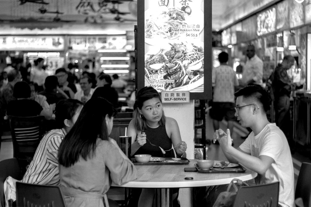
Socialise more. Wait less.
Instead of waiting in line, you can now freely socialise while waiting for your food to be ready. Simply wait for your notification to collect your order without worry.
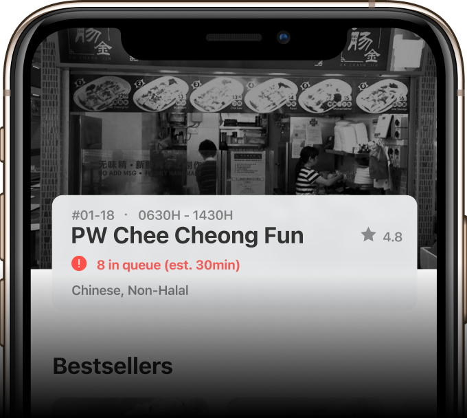
Don't wait aimlessly.
FastQ uses its knowledge of every order (due to an integrated digital experience) to provide an accurate estimate of waiting times.
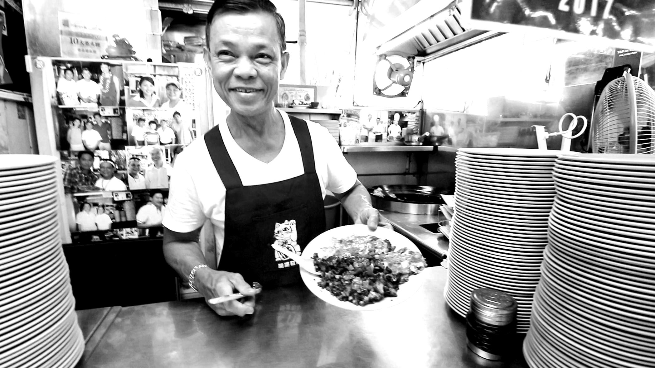
Good food comes first.
Without the need to process transactions or take & remember orders, our Hawkers are able to fully focus on what they do best – serving up delicious food. Hygiene also comes to mind, as cash is dirty and we don’t want your food contaminated.
Why not order in advance?
As we seek to improve the visitor experience, we've also got to remember the people who make it all possible - our Hawkers.
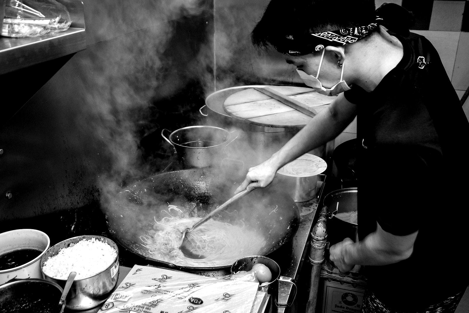
Less distractions, more food.
It’s in our best interest to streamline the process as much as possible for our Hawkers so that you get the best possible experience.
Having preorders is antithetical to our process. It would mean Hawkers have to micromanage orders, especially in the middle of peak hour where things can get messy fast. This more often than not leads to orders being prepared in advance if pre-ordered, which ends up with lower quality of food.
To sum up, FastQ believes in a simple, order-when-you're here approach. This simplifies our Hawker's jobs, and comes at little cost to the customers compared to the benefits it brings.
How we're rolling this out
We understand that such a radical change will require an initial adjustment period. As such, we have put together a plan to gradually roll this system out.

Hotspot areas first.
We plan to roll out the digital queue system to specific Hawker Centres around the Central Business District area first. We believe the main crowd of working adults will be more accustomed to the fast pace of technology, and be most able to adapt to (and see the benefits) in such a change.
Reducing transitional friction.
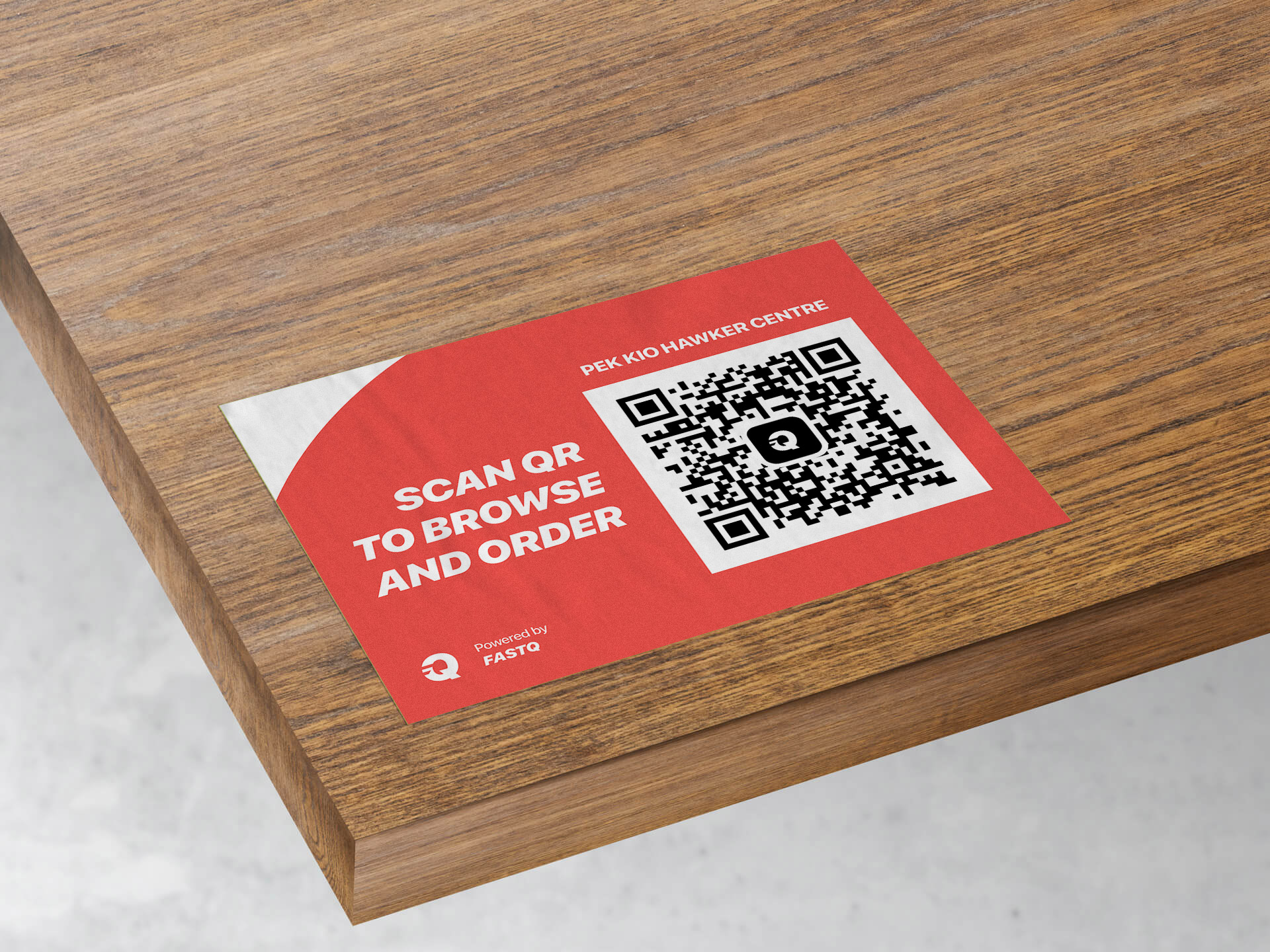
In order to introduce such a change, we have to make it obvious and reduce transitional friction for our visitors. To do so, we’ll be taking advantage of QR codes – which will enable visitors to order through a web adaptation of FastQ.
02 / Introducing FastPass
Having integrated Digital Queues into hawker centres, we can now explore an opportunity otherwise impossible - the ability to skip queues.
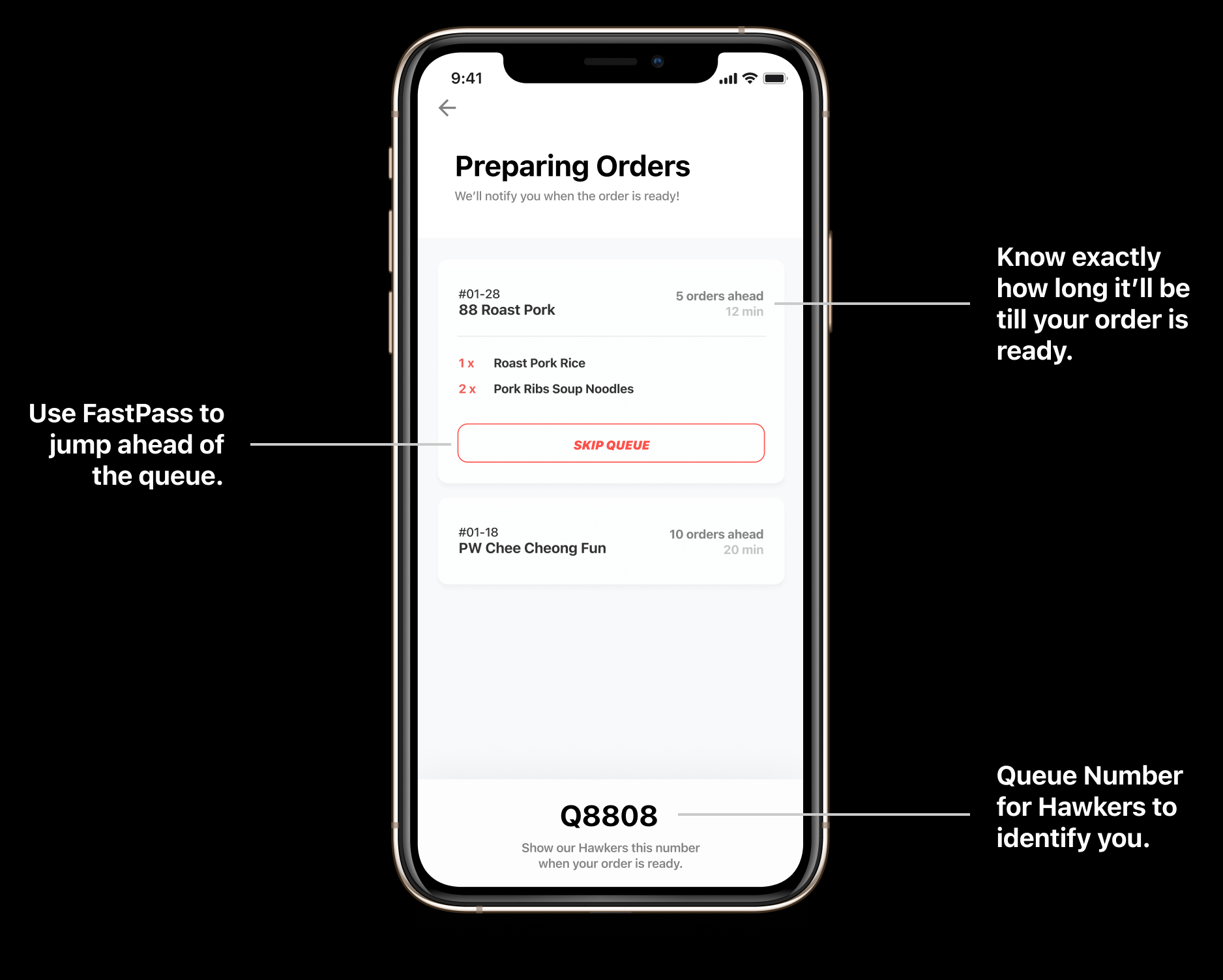
FastPass allows users to skip queues at any Digital Queue hawker centre, at a small monthly fee.
FastPass versus other solutions
FastPass ensures that your food will always be served fresh - and also facilitates an uninterrupted workflow for Hawkers.
Low impact on workflow.
One main caveat of current solutions (deliveries / order-in-advance) is that not all hawkers are keen to get onboard because it interrupts their workflow.
With an entirely digital queue, Hawkers simply focus on preparing the next order without any need to micromanage – and FastPass just bumps your order up to the front.
Always fresh.
As opposed to delivery services where travel time will definitely impact freshness, or an order-in-advance system where Hawkers often opt to prepare your food before the peak crowd arrives (to facilitate workflow), FastPass simply bumps your order to the front.
This means your food will always be fresh off the stove.
Rationale for limited redemptions
When you simply want to try that store that always has long queues but can't afford the time.
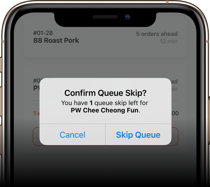
Intentional design.
FastPass is not designed to be used on a daily basis on the same store. The option to skip queues is meant to be a last resort, when you’re really in a rush. This is why we’ve limited the number of redemptions per store to 2 per month.
The limitation on redemptions also helps to maintain equilibrium – after all, if everyone skips the queue, essentially no one skips the queue.
Tipping our hawkers
FastPass provides an easy way to generate revenue for Hawkers without additional labour.
Zero-impact revenue stream.
Because of how FastPass is designed, Hawkers are essentially unaffected by its existence – which means extra revenue without additional labour.
We hope to use this to incentivise and reward our Hawkers – as opposed to eating into profits or surcharging consumer prices past the point of daily viability.
03 / Information Accessibility
FastQ addresses the current lack of information by providing the directories of all hawker centres.
Information is power.
One key frustration with hawker centres is the clear lack of information available online. This makes decision making difficult.
FastQ plans to archive the directories of all hawker centres (regardless of Digital Queue take-up) and make it available to all of Singapore. We believe that this feature will be key to improving the hawker experience across the island.
Key design elements
This is everything that we've implemented into FastQ to assist in decision making at hawker centres.
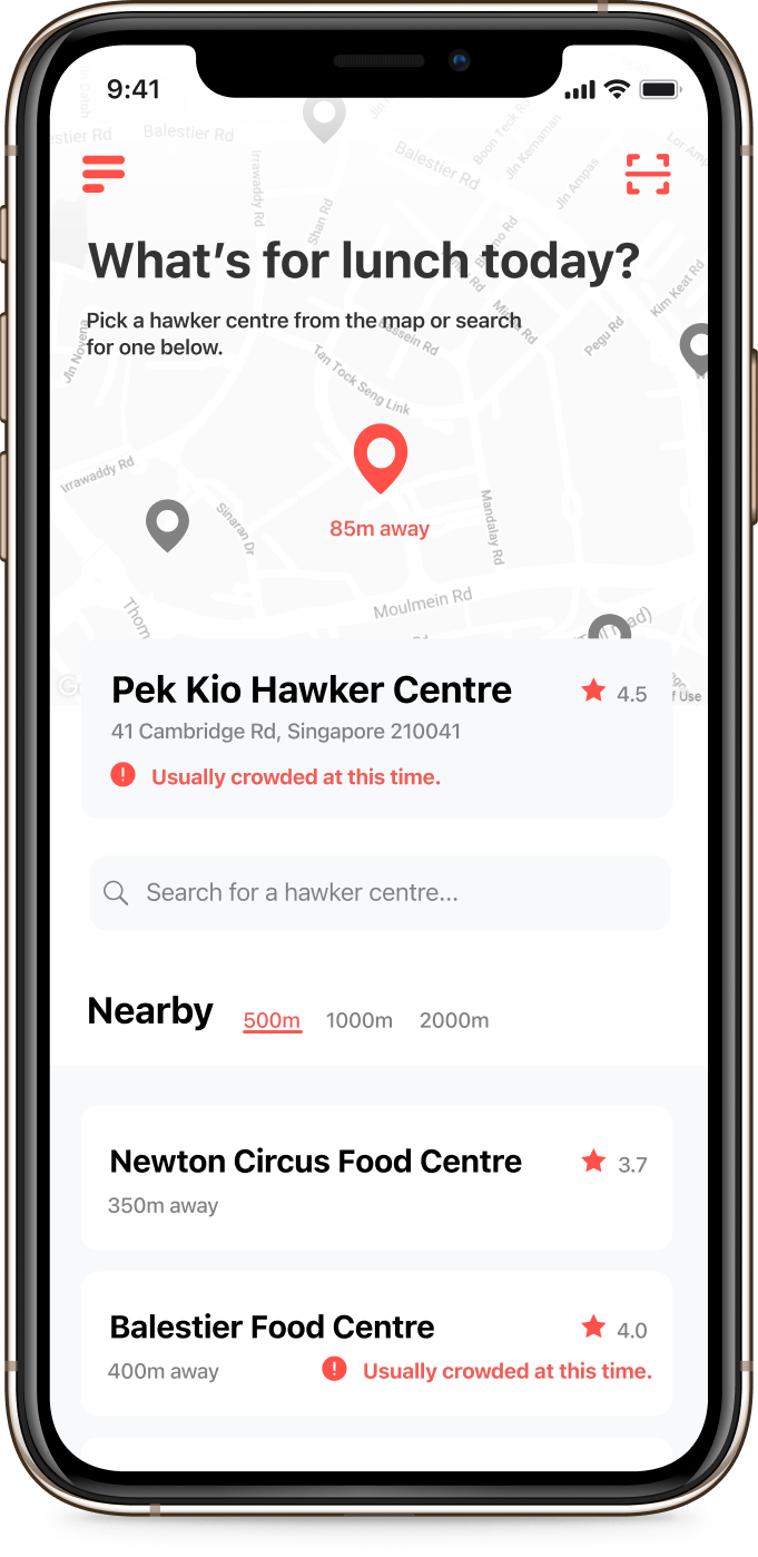
FastQ features the nearest hawker centre by default, then lists other nearby ones by distance.
This made the most sense for the target audience of working adults who often look for options within their proximity.
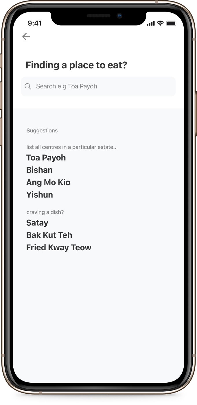
Search for a specific hawker centre, or list all choices in any estate.
View all stores available in any chosen hawker centre, together with their respective opening hours and unit number.
Browse options available based on the dish you want. FastQ displays popular options at every hawker centre by default in cards.
In our research, users tend to decide on a particular dish they want before picking a store. This guided our design decision to prioritise the card carousel.


