ux/ui design
Netflix Parties
Netflix Party is a browser extension that synchronises video playback between multiple users, allowing people to watch Netflix together online. This service blew up in the early stages of the COVID-19 pandemic, as more countries started to limit social interactions.
This project is my personal take on how such a feature might look like if it were natively implemented into Netflix.
watch the demo
Process
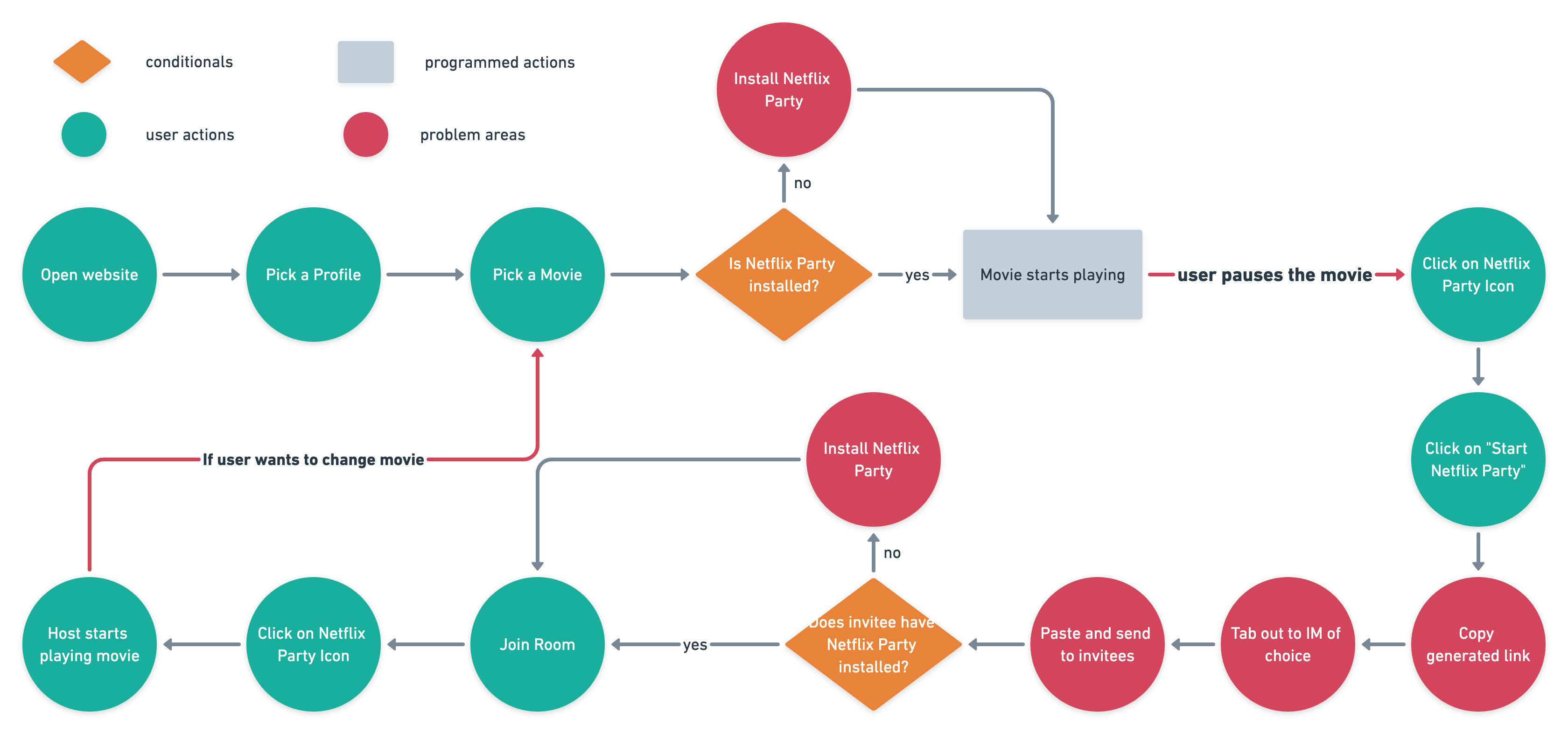
To start off, I first identified issues that users experienced with the Netflix Party extension. To do so, I drew up the current user flow, making it easy to pinpoint potential pain points.
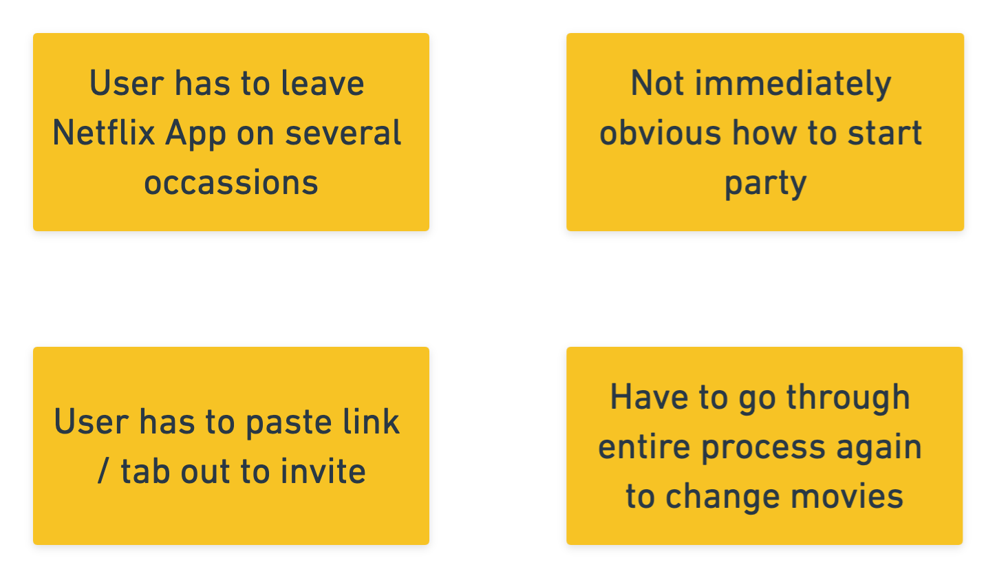
With the current user flow, a few issues became apparent. I listed them down, with a goal of tackling them in the integrated design.
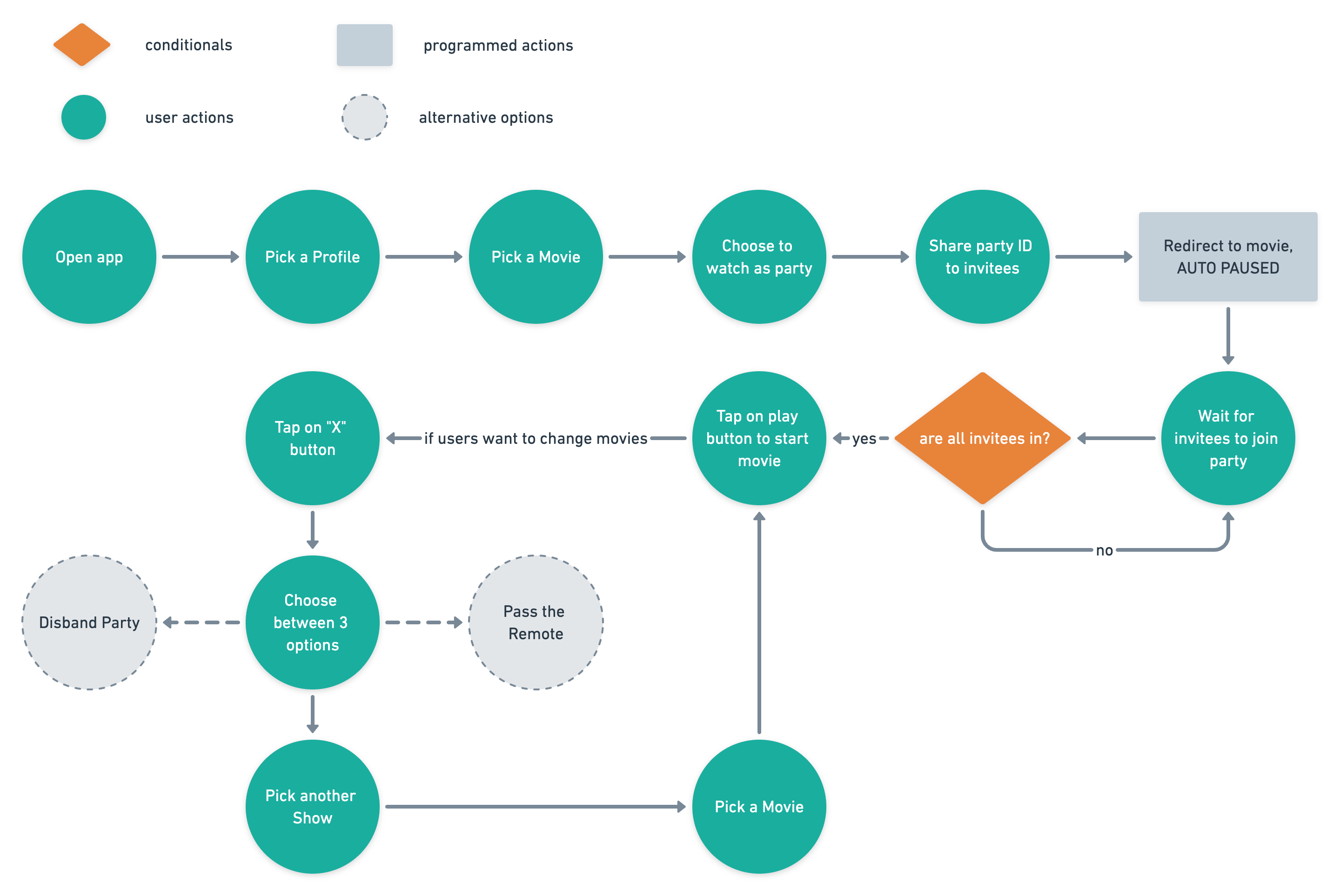
The updated user flow helped to ensure that the key issues identified were tackled and that there were no other glaring problems to be addressed.
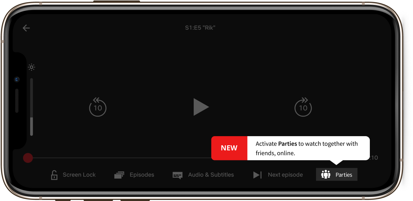
The final cut.
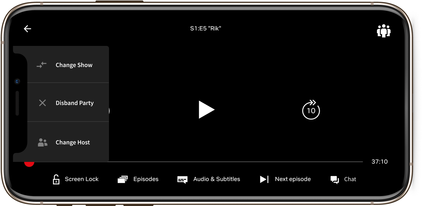
With the user needs in mind, and based off the proposed user flow, an initial prototype was created for further usability testing.
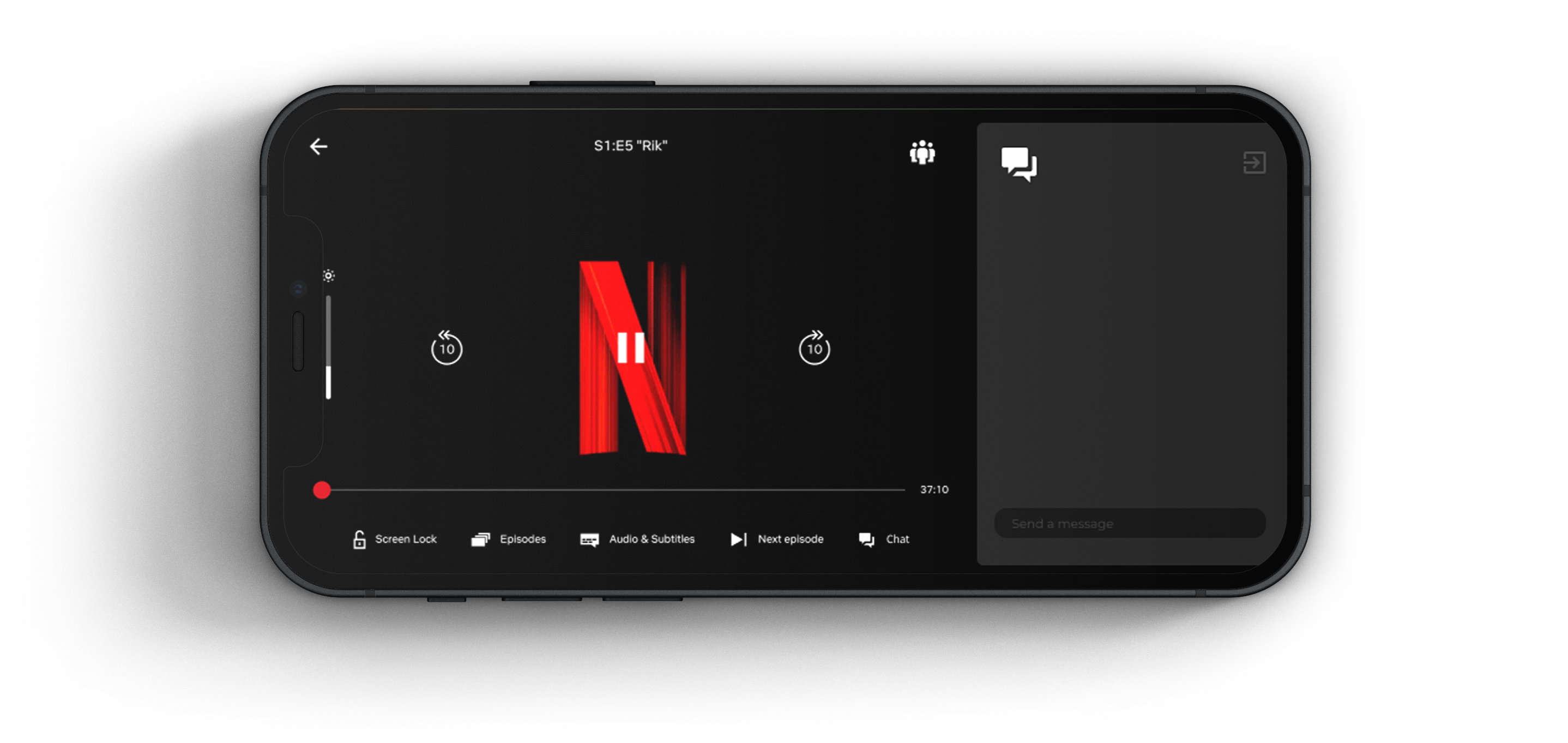
Just chill and watch.
Seamless integration with a clear flow, so you can just enjoy a good show with your friends entirely within the Netflix app.

